Friday, September 18, 2009

Learning to Backstroke Midstream

(Or Please Forgive the Blue Tape).....


One of the most difficult moments in a designer's career is when you are forced to shift aesthetic focus mid-job, which is sometimes (more often than one would like) the case when you are designing a spec home. When a house is bought before it hits the market and, more importantly, while it remains unfinished, the opportunity for the buyer to make changes is more tempting and probable. Everyone likes to make a home their own.

It is a mixed-blessing of sorts; on the one hand, the house is getting sold in a volatile market, but on the other hand, the design is not complete,and the overall vision is not fully realized. This is most heart-breaking for the designer.

For obvious reasons, so many builders (mostly male, I'm afraid) repeat the same design and use the same neutral materials in every bathroom when putting together a spec home. They want to appeal to a wider audience by staying neutral (and blah) and they don't want to spend a lot of time and money on designs. They feel very comfortable with natural stone in various forms everywhere. I mean it worked in Greece and Italy for centuries, right?

My partner and I were lucky enough to find a developer/builder who trusts that good design takes talent and experience and collaboration. Having a background in development and building, and being designers, we have a special interest in standing out from other spec builders.

Currently, we are midstream on a couple of Spanish-style homes in the Menlo Park area. One is a more modern interpretation with cleaned-up tile designs that suggest an earlier deco era, but make use of glass mosaic, ceramic tile and natural stone in a contemporary way. For earlier interested buyers, young and hip East Coast parents with 2 young twins, this was very appealing. When this buyer found another better-fitting home, we as the designers went with this aesthetic tidying it up and making it feel even more unique and cohesive. However, a new buyer stepped in several months later and wanted to turn the tide.

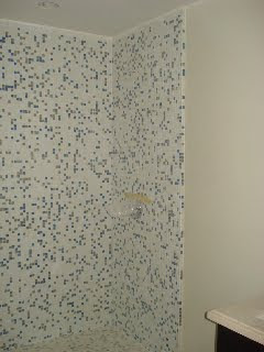
My only disclaimer is that the bathrooms featured below were never finished, and have since been torn out. Some of our other designs were saved and will be featured at a later date. As most designers can relate, my partner and I wanted the fleeting-designs to see the light of day even in their disrobed state.

So here they are......
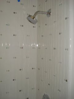

This was one of the kid's bathrooms.....so young and fresh!
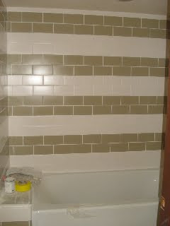
This is the downstairs guest bathroom.

This beautiful deco mosaic was the guest room bath.
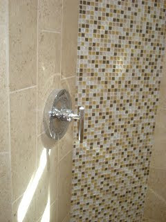
And this stunner was the master bath (also pictured above), neutral yet sparkling.

I am only picturing those bathrooms that have been torn out due to the new buyer's aesthetic difference.

The upside is of course, there will be more creative output, new designs and perhaps more customized finishes due to pride of ownership. It is our job as designers to go with the flow and work with our client, whomever that may end up being, with grace, compassion and of course, good design.

May these designs rest in peace.....


Wednesday, June 24, 2009

City of the Future


We've all heard how in the not-too distant future (remember Edgar Cayce's predictions) Manhattan and California fall into the sea. Well, after visiting NYC last week and experiencing the rare cold and rainy June weather, I was beginning to wonder. Though I was happy to see some optimistic planning ahead for a more cutting-edge NYC, a city of the future.

I had the fortunate experience of staying at Andre Balazs's new Standard Hotel in the Meat-Packing District, which was opened to accolades in January. The views as many have noted are just stunning. The look is certainly a nod to Le Corbusier, steel and concrete rising 18 floors up on stilts above the High Line which is now a revamped park and sunset-viewing lounge replete with wooden chaise party-seating.


There are also sleekly-designed concrete, wood and steel benches that rise out of the grassy landscape which reference the original railroad rails and ties that peek through the native plants.


The best part after the noteworthy views is certainly the neighborhood, with an assortment of high-end boutiques, ethnic restaurants and rough and tumble bars (Hogs and Heifers, no less). The latest foodfare craze is the specialty catering truck.


The vibrant yellow picnic tables that don that front patio of The Standard are perfect for taking advantage of the gourmet fast food.


Try Rickshaw Dumplings for amazing vegetarian dumplings (filled with yummy pureed edamame) and Van Leeuwen for homemade ice cream (made from Michel Cluizel dark chocolate). Perfect for an easy dinner, then a walk on the High Line for the late summer sunset.


There is even an amphitheater for viewing the mesmerizing west end traffic.

Now tell me this view from the High Line doesn't look futuristic...

Thursday, April 2, 2009

Can Green Go Gorgeous?


Can a green kitchen also be gorgeous? We attended the first design seminar of the year at the San Francisco Design Center this past week to kick-off the Designer's Wednesdays series for 2009. The title of the seminar was "Dream Green Kitchens," which was ultimately misleading. The speaker was Jennifer Roberts, author of several books (Good Green Kitchens, Good Green Homes and Redux) on green design . Her presentation was informative on the current green issues, however all examples she cited showed zen, minimal and contemporary kitchens. Don't get me wrong....theses kitchens can be pretty. But do they work in a Victorian, Mediterranean or Beach Bungalow? Pictured above is one of our most popular kitchens. While we used a vintage sink below the window and vintage fabric for the skirt, energy star appliances and flourescent lighting. Could this same look be achieved using even more green materials or does "going green" mean sacrificing aesthetics?

Jennifer's presentation focused on the basics of green design, which to most interior designers living in the Bay Area is old hat. In sum, she talked about going beyond what should be the bare minimum in energy-saving techniques, i.e. comparing only energy-star appliances to find the best of the best, utilizing LED and fluorescents, adding insulation, strategically-placed dual-pane windows, etc. By looking for creative ways to utilize space, by doing research before you purchase, by asking suppliers the hard questions even though you may not have any choice in what you ultimately purchase for your clients, and by asking your clients how much they really need what they are contemplating buying, in other words can they reuse any of their old stuff, a designer can stay at the cutting-edge of eco-savvy design.


Of course, the latest issues of Metropolitan Home, Domino and even Bon Appetit have something to add to the subject, more in line with the challenges of a die-hard aesthete. There are the latest in LEED-certified fabrics, wallpapers and textiles. There are stunning spreads on Manhattan renovations with energy-conscious upgrades, mostly windows, radiant heating, no-VOC paints and FSC-approved wood flooring and cabinetry (Metropolitan Home, April 2009). But nary a one has a traditional-looking kitchen that offers aesthetic warmth AND efficiency. Nearly every kitchen featured in a green project has contemporary modular kitchen cabinets with composite surfaces and concrete floors. No one expects a green project to be completely free of every known toxin, but at this juncture is the state of modern kitchen design stuck in the box (think, cargo)? Can you ever feel good about importing a Boffi or Arclinea kitchen from Italy?


Thinking outside the box, my partner and I came up with the following 3 major design areas which can make a difference in the overall look and feel of your green kitchen (more product recommendations are welcome...):

1. Cabinetry & Hardware: FSC-approved sustainable wood products, natural stain or no-VOC paint are givens. Many local lumber yards have a selection of sustainable woods. As Jennifer mentioned, verify your cabinetmaker uses FSC-certified woods. Local to the Bay Area, Silverwalker Cabinetry (www.silverwalker.com) and Woodshanti Cooperative (ww.woodshanti.com) can both fabricate a wide range of styles customized to suit your home. Places like Liz's Antique Hardware on La Brea in LA (www.lahardware.com) are great for resourcing vintage cabinet hardware and door handles which can provide a classic look.

2. Surfaces: Most "ceramic" green tiles are really muddy-looking or worse, bright and gaudy, which is why the recycled glass tile has become so popular. The colors can be crisp and clean or subtle and spa-like depending on your design. There are also tiles made from recycled metals and bamboo tiles. I was thinking the days of the clean white tile might be gone...then I discovered Terra Green's new ceramic tile line called Elements, which offers 10 matte colors with a sateen finish, including one called Air which may serve as a clean white field tile (I'll have to order a sample)...On the Terra Green Ceramics site, these tiles are noted to have LEED relevance (whatever that means) and use 55% recycled matter. I think nice-looking tiles made of recycled products are lacking overall.

In terms of countertops and flooring, recycled composite surface materials like Ice Stone, Vetrazzo and Paperstone are recycled and thus green products. I have to say only the Paperstone looks subtle and classic, but I am concerned about the long-term wear and tear. Natural stone like marble, granite, and slate are made more beautiful over time and have a warm and natural look that hasn't replicated with a composite material in my opinion. There's something naturally durable about stone pulled from the earth, that was formed over hundreds of thousands of years with water flowing over and through it and subjected to the harshness of the earth's formation that stands the test of time.

3. Lighting: Besides using LED undercabinet lighting and skylights for added natural light, a kitchen island or table is a great place to showcase style with vintage lighting or statement pieces offered at eco-conscious sites like re:modern.com.


like the recylced bottle lighting by Jerry Kott


or the bendant hanging light by mio which is made to use with a compact fluorescent.


For some noteworthy examples of green style (emphasis on the style) from the latest issues of design magazines, there is the "Greenest Little House in America" located in Oakland, Ca. and a great example of achieving the balance between style and efficiency (also in Metropolitan Home, April 2009).


There is the marriage of a modern kitchen with a Victorian structure, which happens to be my favorite (Bon Appetit, April 2009).


Anyone know of any other new green resources that can make a beautiful addition to a more traditional kitchen?

Sunday, March 29, 2009

Trina Turk Goes Outdoors

This past Wednesday evening in Silverlake, we had the pleasure of clinking glasses of La Crema Pinot (soooo yummy!) with Trina Turk who opened her home to celebrate the launch of her outdoor fabric line with Schumacher. Hosted by C Magazine, style editor Andrea Stanford and Trina and her photographer husband Jonathan Skow, the party was filled with designers fresh from West Week, showroom owners and charmers as well as the design-savvy (and an LA b-list actor thrown-in for good measure). The magic hour glow and the chic poolside setting was ideal for showcasing her sunny California prints.

Danielle (pictured to the right of Trina) says:

What I like about Trina Turk's clothing is her simple classic silhouettes, a great shift, a clean-cut pair of high-waisted shorts, a slim-fit pair of cropped pants. But what makes her designs so appealing is her fabrics and color selections. Her fabrics are always bold, colorful and fun. They feel like a throwback to a simpler, more glamorous time when the well-to-do partied in Palm Springs while sipping martinis.


Rumor has it that Trina is a collector of vintage fabrics and whether it's true or not her designs have that vintage feel. Trina has successfully taken her signature fabric designs and created a new and fresh-feeling for outdoor fabrics. The graphics are so striking and cheerful, it's hard not to imagine them poolside in the desert as a backdrop to a glamorous cocktail party.

Trina's line offers a variety of colors, graphics and
over-sized paisley designs.


She's really made it hard to decide which one to pick as a favorite. While Trina showcased the oranges, yellows, browns and pinks at her home, I'm attracted to the cool blues, greens, and yellows. And who doesn't love a plush white beach towel a la The Four Seasons? Now the whites can reside on a wildly beautiful backdrop...Cannonball anyone?


Carrie (above pictured to the left of Trina) says:

While I've never been a fan of her clothing,
I find that her retro-kitsch style translates better to outdoor fabrics where the vibrant, lively graphics can play against the green field of a well-manicured lawn and the turquoise blue of a swimming pool, bringing the yard to life, inviting you outside like a dazzling bed of flowers or the painterly-hued blossoms of a lilac tree without having to wait for Spring. Trina Turk's jazzy coordinates scream, "Pool Party!" or even better, "Cocktail Hour!" Blown-up in scale, her signature fabrics are right at home in the yard where a more subtle approach would be overlooked.

Trina Turk Residential's line for Schumacher showcased well in her mid-century modern home, becoming sexier at night with the fashionably dressed crowd lounging on them. And the fabrics really livened up Schumacher's showroom at the Pacific Design Center.


Where her patterns can be dizzying on a moving target, they settle nicely on the lawn, the cool steely frame of a chaise chair, and even a mid-century bench. I plan to use them to brighten up a kitchen nook.


I think Trina has a great eye for dramatic textile design and hope she continues to create more in this direction. Her pillows and signature candles (an invigorating citrus-scented one was given as swag) can be scooped up at her home boutique in Palm Springs. Road trip, anyone?